Most people think that split testing is as simple as just throwing together a new version of a page and running a test to see which one is better, and then hoping that you eventually find a version which works better than the original.
This method can work, but the problem is that at least half the time your test will not produce an improvement, and so you keep the original and try again… But even when you do find a better version, the improvement will probably be small.
If you want to make big improvements quickly you need to start by understanding how your users use your website and where the opportunities for improvement lie – because often, doing so will give you ideas that you didn’t expect.
So without further ado…
In this post I thought it would be fun to show you one of the tools we use for this purpose:
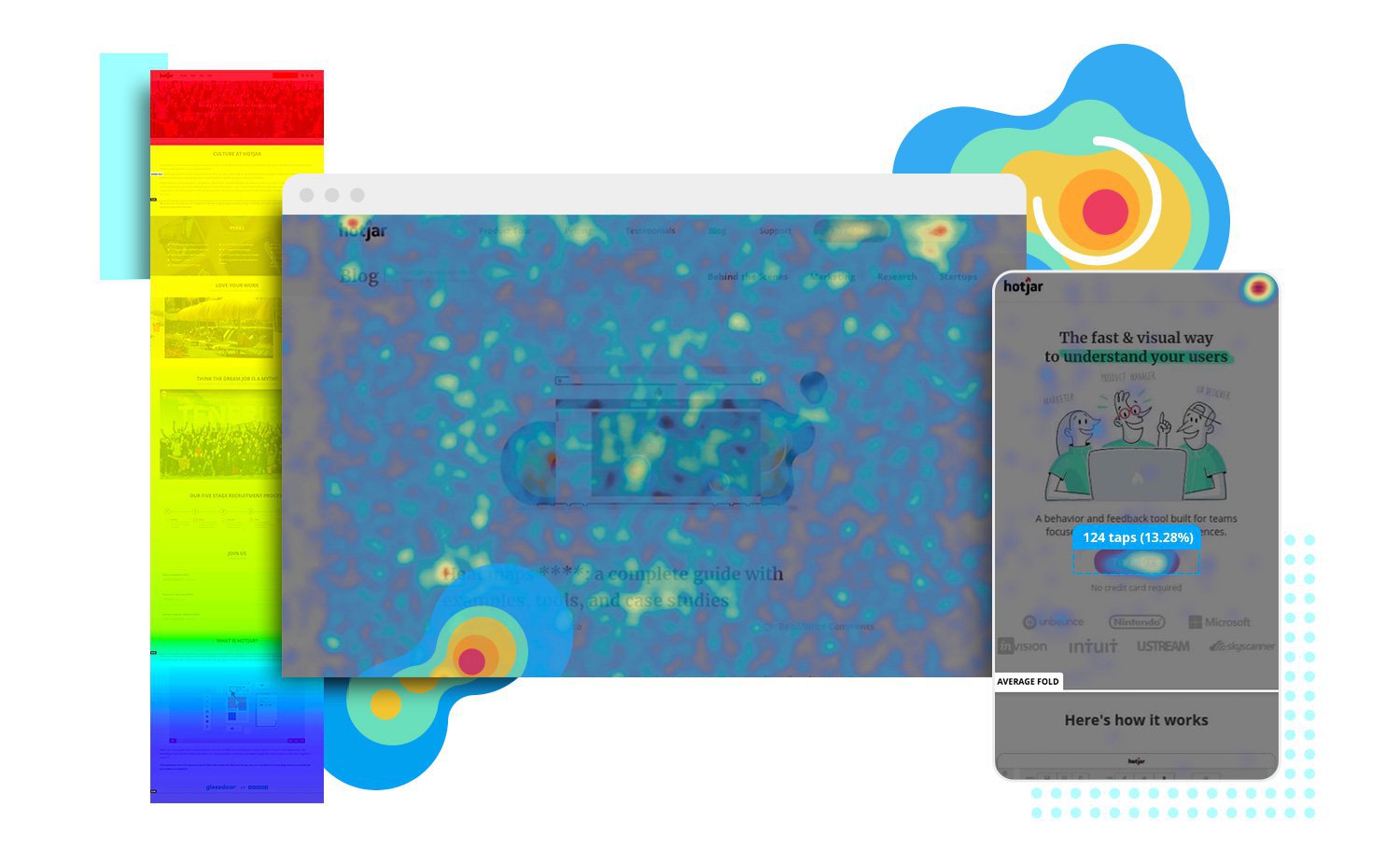
Mouse Movement Heat Maps
There are a few services which offer this functionality, you may know of Crazy Egg, but there are also a couple called click tale and session cam. More on those another time, but whichever service you use the result is basically the same…
So as an example, here is a heatmap from the home page of our old website – we have since moved to focusing on CRO since it is a service we thoroughly enjoy and believe has a great future. This particular map is for mouse movement, so the coloured areas show where the users have had the mouse for most of the time on site.
Note about eye tracking:
In studies it has been estimated that there is at least an 85% correlation between mouse cursor position and where the user is looking, so mouse movement heatmaps give a good indication of where the user’s attention is.
As you can see, this home page devotes most of the area above the fold to the three services which we offered at the time. Which when we designed it we thought would lead to a good conversion rate.
Our conversion goal was to get the user to click on one of those three services, but this heat map showed us a few things:
- The top navigation links seem to have more attention than the main calls to action
- A lot of users want to check the about us page before looking into our services
- The testimonials box lower down the page seems to get a lot of attention
What Can We Do With This Information?
Well there are a few ways we can use this information. Ideally we would try to combine this information with other data from other sources such as Google Analytics, but from this heatmap alone we can come up with a couple of ideas for our next split test:
Prioritising “About Us”
In this design we have given a lot of space to selling our services, but taking a softer approach and prioritising an “about us” area on the home page could be effective. This also suggests that the about page would be worth spending more time on, as it is clearly a key part of the sales process.
Prioritising testimonials
Again, rather than focusing on our services, it is clear that our audience cares more about who we are and are happy to find out what services we offer but only once they have decided what they think of our business.
Conclusions – Next Steps
The next step from here would probably be to design a variation to test these ideas…
So we would look to change the focus of the home page to talk more about who we are than what we do. We would bring the testimonials higher up the page and leave the selling for later, possibly going for a general consultation request rather than attempting to funnel the user to a particular service (since the user may not even be sure what they want).
I will talk about the actual tests and the results later on. But I hope this post has been interesting and given you some ideas about how you can get to know your own visitors.