In case you didn’t know – the mobile revolution is going strong and more and more people are using phones and tablets to access the internet. To make the situation even trickier though, people are also still using regular computers and they expect their experience when switching from one to the other to be pretty much seamless.
This is what responsive design is all about – making your site looks its best on every platform. And one simple way to do that is to use Bootstrap. Here’s how:
Warning:
To use Bootstrap effectively you will need to be familiar with HTML and CSS. Bootstrap will make your job easier, but it won’t do it for you.
What Is It?
Bootstrap is a CSS framework, although it also includes a library of Javascript Plugins and some other stuff. Essentially it is a well thought out set of styles which make laying out an HTML site simple and quicker than starting from scratch.
In its simplest form Bootstrap is a CSS file and a JS file. You just write the HTML using a pre-designed set of styles and a grid layout system and everything works.
Option 1 – Using LESS
In case you’re not familiar, LESS is a system for compiling CSS. If you are familiar with LESS you can download the code files for Bootstrap and then tweak variables (such as colors, font-sizes etc..) directly, before compiling your own code. This is a little beyond the scope of this post, so if you don’t know how to use LESS, don’t worry about this option – it’s not essential.
Option 2 – Download The Files
The second option is to just download the pre-compiled CSS and JS files (plus some other stuff). You can do that at the Bootstrap website. You then create your own HTML files and upload the whole lot as you usually would with any other HTML/CSS/JS file.
Option 3 – Use The CDN
The simplest option of all is to use the Bootsrap CDN. All of the required CSS and JS is hosted at MAXCDN, so all you need to do is create an HTML file and link to those files in your code and everything will just work. For getting started this is the easiest option, so I will assume you are using the CDN for now.
Creating A Simple HTML File
All you really need to do is create a single HTML file, but it’s a good idea to also create your own CSS file as this is how you will modify the design to your own requirements. Once you know the appropriate classes and system, you can also use Bootstrap to create a theme for any CMS (such as WordPress), but that’s a topic for another post!
- Create an HTML file called index.html
- Create a CSS file called style.css
Open up both using notepad (I personally use Notepad++)
The Head Section
First, you need to start your HTML file. For best compatibility you need to include a doctype and the usual html and head tags. Also to ensure mobile compatibility we will include a view port tag. So paste this into your HTML file:
<!DOCTYPE html>
<html lang="en">
<head>
<meta charset="utf-8">
<meta http-equiv="X-UA-Compatible" content="IE=edge">
Next we want to link to the relevant files. There is one CSS file which is required and then an additional theme file which is optional and provides a little bit of extra styling. For the time being use both. And finally there is a JS file which contains all of the plugins you might need, although you also need to include JQuery to make them work correctly.
So add these lines to the head section:
<link rel="stylesheet"
href="https://maxcdn.bootstrapcdn.com/bootstrap/3.2.0/css/bootstrap.min.css">
<link rel="stylesheet"
href="https://maxcdn.bootstrapcdn.com/bootstrap/3.2.0/css/bootstrap-theme.min.css">
And this line to link to your own style sheet:
<link rel="stylesheet" href="style.css ">
And add these to the footer of the page before </body> (to help the page load faster):
<script src="https://ajax.googleapis.com/ajax/libs/jquery/1.11.1/jquery.min.js">
</script>
<script src="https://maxcdn.bootstrapcdn.com/bootstrap/3.2.0/js/bootstrap.min.js">
</script>
Finally, there is one little hack required to make Bootstrap work in internet explorer 8 and below, so if you want to cover all your bases, add this in the head section.
<!--[if lt IE 9]>
<script src="https://oss.maxcdn.com/html5shiv/3.7.2/html5shiv.min.js">
</script>
<script src="https://oss.maxcdn.com/respond/1.4.2/respond.min.js">
</script>
<![endif]-->
That’s it, your file is now linked to Bootstraps core files, which means that once you have learned the relevant classes you can add HTML to your body and it will behave as expected.
On the Bootstrap website there is full documentation of the CSS, structure and Javascript, but for a first time user there is a lot to take in and to learn. So let’s start with the basics:
The Grid System
Bootstrap is designed with a 12 column grid layout. So any DIV that you create can span 1 to 12 columns. You can have 12 1 column DIVs on a row, or you could have 3 4 column DIVs etc…
Additionally though, you can change how many columns a DIV spans based on the size of the screen. As standard Bootstrap will react to 4 different screen sizes:
- Extra-small (xs): less than 768px
- Small (sm): less than 992px
- Medium (md): less than 1200px
- Large (lg): 1200px or more
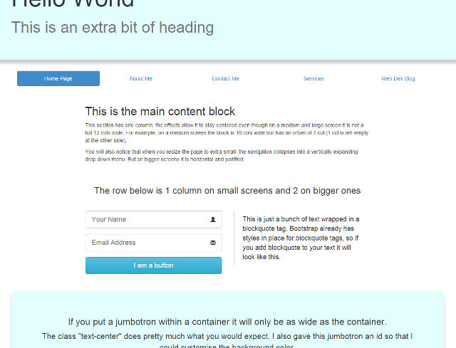
Every piece of regular content will go inside a container DIV which centers itself and fixes the width within each screen size. The container contains ROWs and the ROWs contain COLs. So let’s create a simple 2-column layout…
To get started, just start writing your HTML between the <body> tags as you normally would:
<div class='container'>
<div class='row'>
<div class='col-xs-6'>
<p>Enter your content here</p>
</div>
<div class='col-xs-6'>
<p>And some more content here</p>
</div>
</div>
</div>
As you can see, the first two DIVs have the classes “container” and “row” respectively. Everything with the DIV “row” is considered a row, and each row can contain 12 columns.
The two DIVs within the row have the class “col-xs-6″. Col simply tells Bootstrap that this is a column, the xs tells Bootstrap that we want this class to apply on screen sizes which are Extra-small. In the absence of further instructions, all rules are applied to the relevant screen size and everything bigger, so in essence this instruction applies to ALL screen sizes.
Finally, the “6” means that this DIV will span 6 columns. Since there are 12 columns available, this means that this DIV will take up 50% of the container. And since there are 2 blocks, that means the row is full.
Making It Responsive
So we now have a very basic 2 column layout, but on a mobile screen we probably only really want 1 column, and on a large screen we might want 3 columns, so let’s adjust our HTML slightly.
<div class='container'>
<div class='row'>
<div class='col-xs-12 col-sm-6 col-lg-3'>
<p>Enter your content here</p>
</div>
<div class='col-xs-12 col-sm-6 col-lg-6'>
<p>And some more content here</p>
</div>
<div class='col-xs-12 col-sm-12 col-lg-3'>
<p>This is our third column content</p>
</div>
</div>
</div>
Ok, so remember that all classes apply on the stated screen size and upwards, unless over-ridden by another class? Let’s look at that first block:
- col-xs-12:
On an extra small screen the block will span 12 columns / the entire screen - col-sm-6:
On a small screen the block will span only 6 columns / 50% of the container - col-lg-3:
On a large screen the block will span 3 columns / 25% of the container
Since there is no instruction for a medium screen, the block will follow the “sm” instruction when the screen is either small or medium sized.
So how will the above code work overall:
On an extra small screen all three blocks will be 100% wide, which means they will stack horizontally for easy vertical scrolling on phones and tablets.
On a small screen or a medium screen, the first two blocks switch to being 50% of the container, so they will form a 2 column layout, with the third block still being 12 cols wide and hence taking up 100% of the next row.
On a large screen the first and third blocks switch down to a width of only 3, while the middle block stays at 6. Since 3 + 6 + 3 is not more than 12, all three blocks now fit on one row, resulting in a three column layout for the biggest screens.
Outside Of Containers
The grid layout allows some pretty complex designs and a row can of course contain any combination of blocks. Once you fill one row you can close the row and start another row or you can close the container and create a section which spans the whole width:
Use this code outside of any containers you may have:
<div class='jumbotron'>
<div class='container'>
<h1>This is a main header</h1>
</div>
</div>
The “jumbotron” when used outside of a container will span 100% of the width of the page, and has a grey background (which you can of course change later). By putting a container within the jumbotron, you ensure that your content is still within the center block.
Other Stuff That You Can Do
There is so much more that Bootstrap can do, so the next step is to read the full documentation. In most cases, whatever you want to achieve is simply a question of adding the correct class to the appropriate element.
All of the typography, forms, images etc… are already styled so that they look good. So when you add a button for instance, you just add the following classes:
class=”btn btn-primary btn-large”
And the button will have a nice polished style, it will take on the “primary” color (blue by default) and be large. All form fields automatically match and if you want an image to have rounded corners you just add the class img-rounded.
The best way to learn from here is to experiment with your own HTML page. Any time you want to add an element, read the appropriate part of the documentation to find out the relevant classes.
And of course if you want to modify or tweak the design, simply add a new rule to your own CSS file to over-ride the Bootstrap CSS. You can either edit an entire class, or simply give the element an ID and add style for that ID (by default ID over-rides CLASS in CSS).
My Example Page
Here is an example piece of HTML, I have left out the header and footer, so this is just the HTML you would put within the body itself. Here is a link to a file using this exact html (view source to see it in action if you like).